** The mind-boggling complexity of this Boeing
747-200 is a thing of the past. The new
avionics mission is ease of use, and as usual
GA leads the way.**
The idea behind avionics is that they should do what we want them to do without causing undo hassle or requiring too much attention on our part, attention we should be giving to flying the airplane. It’s like Facebook, the remarkably successful website that has attracted hundreds of millions of followers by giving them what they want, a simple, easy way to stay in touch with their friends and family. When people complain about Facebook, it’s either that it’s trying to do something apart from that main mission or that some feature is too complicated to use. When it comes to technology, the new lesson is that “complicated” is bad.
We're finally getting that lesson in aviation. There's been a trend these past 10 or 15 years among avionics manufacturers to make their products easier and easier to use. The movement has its roots in the world of computers, which is as it should be; today's avionics are merely specialized computer systems, many of them running subsets of commercial off-the-shelf operating systems. If you want to understand "easy," think iPad. Apple's megapopular tablet wasn't the first such product by a long shot. It was just the easiest and most satisfying to use.
When I say that avionics are “merely” offshoots of consumer systems, I’m being a bit facetious. Computerized avionics systems not only require sensor systems that are exotic by mainstream standards — such as AHRS and air data sensors — but they also depend on software that is required to be orders of magnitude more stable than consumer software, for obvious reasons. A crash on one’s desktop computer has far more pedestrian consequences than a crash on one’s digital flight deck.
More and more “flying” incorporates managing these computer systems, and that has caused a backlash, culturally and operationally. Many pilots who have been flying since before the advent of GPS moving map navigators — which wasn’t that long ago — feel as though the nature and essential craft of what we do has been changed in the rush to leverage technology for improved safety.
The move to make our flying lives simpler and our cockpit capabilities more powerful is not a new one. Modern computer technology has just allowed it to succeed at an unprecedented pace. The moving map is a good case in point. While the modern moving map has really been in our cockpits for only the past 20 years or so, most notably with the ubiquitous Garmin GNS 430 pocket-size FMS, attempts to automatically plot our position on a map began with the advent of long-range aerial navigation in the 1930s, with clever mechanical devices that held maps and were designed to turn navigation data into position information, which after all is what a moving map is all about and what we want. An HSI is really just a Rube Goldberg attempt at doing the same thing using the best available technology of the day. Thank goodness we've figured out how to get a computer and a display to do the job far more elegantly.
For decades our cockpits have had a lot of data for us to use as we would. The problem, and it was a big problem, was that the data was presented in a way that was really hard for the average pilot to use. As much as you might feel warm and fuzzy about this antique technology, a VOR indicator is a human factors nightmare. For that matter, VORs are horribly outdated as well, while still being very useful, that is, because they’re still a good backup to modern technology. A VOR, let’s remember, is an incredibly complex system for figuring out something simple: where you are laterally from a fixed position on Earth, the spot in the ground somewhere, next to a busy urban airport or along the side of some remote highway in New Mexico, where the VOR transmitter and its not-so-little building is situated. Moreover, the cockpit technology we employ to make use of a VOR’s signal is equally archaic, a pilot-adjustable spinning card from which we divine in which direction the station is — wait, is that to the station or from it?
With a moving map, the pilot can see a 2-D representation of the airplane and the station. This capability, to know where we are and where we’re going, is what we really want to know. OBSs, RMIs, ADFs and to/from indicators are technological relics, mechanisms that were once the best way we had of doing something technologically complicated. Computers can do all that better, more simply and more intuitively. Thank goodness.
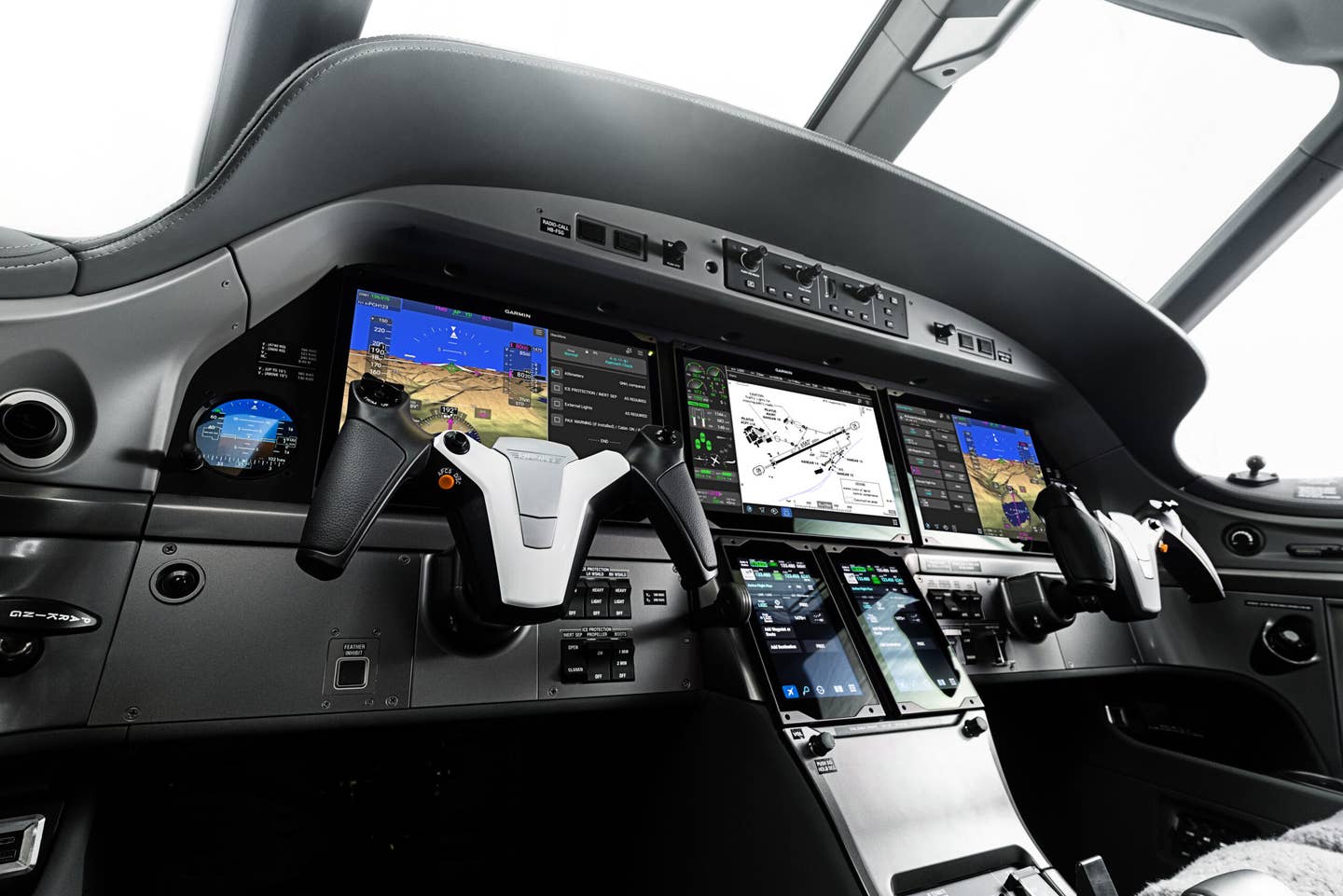
One element of the computer that's taken a while to make its way into the cockpit is ease of use. Happily, that is changing, thanks to advances from major avionics manufacturers, noteably Garmin, with its G2000, G3000 and G5000 cockpits, and Rockwell Collins, with its scalable Fusion platform. This is to take nothing away from the remarkable hardware innovations that both companies continue to make. Collins' advances are arguably most noteworthy in terms of HUD development and communications, and Garmin has pioneered in envelope protection and ADS-B, among others.
While features are important, ease of use is arguably the new frontier of avionics design.
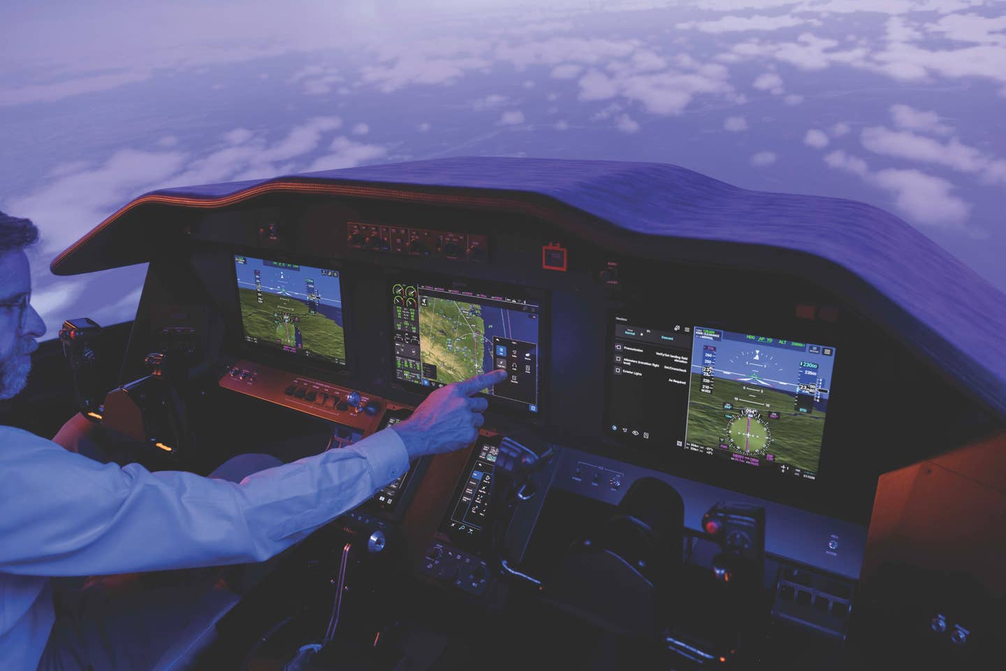
Rockwell Collins, which has enjoyed tremendous success with its Pro Line 21 range of flat-panel avionics products, has for the past several years been developing Fusion, which seeks to turn Pro Line on its head. While Pro Line 21 has numerous advanced safety utilities, it is in terms of architecture an old-fashioned FMS-based avionics system. Fusion is a completely different take on what avionics are and what they should be. With touch-screen displays, graphical flight planning, HUD symbology that matches that on the PFD, one-button attitude deviation recovery button and much more, Rockwell Collins has re-envisioned its avionics and put itself in a leadership position in the process.
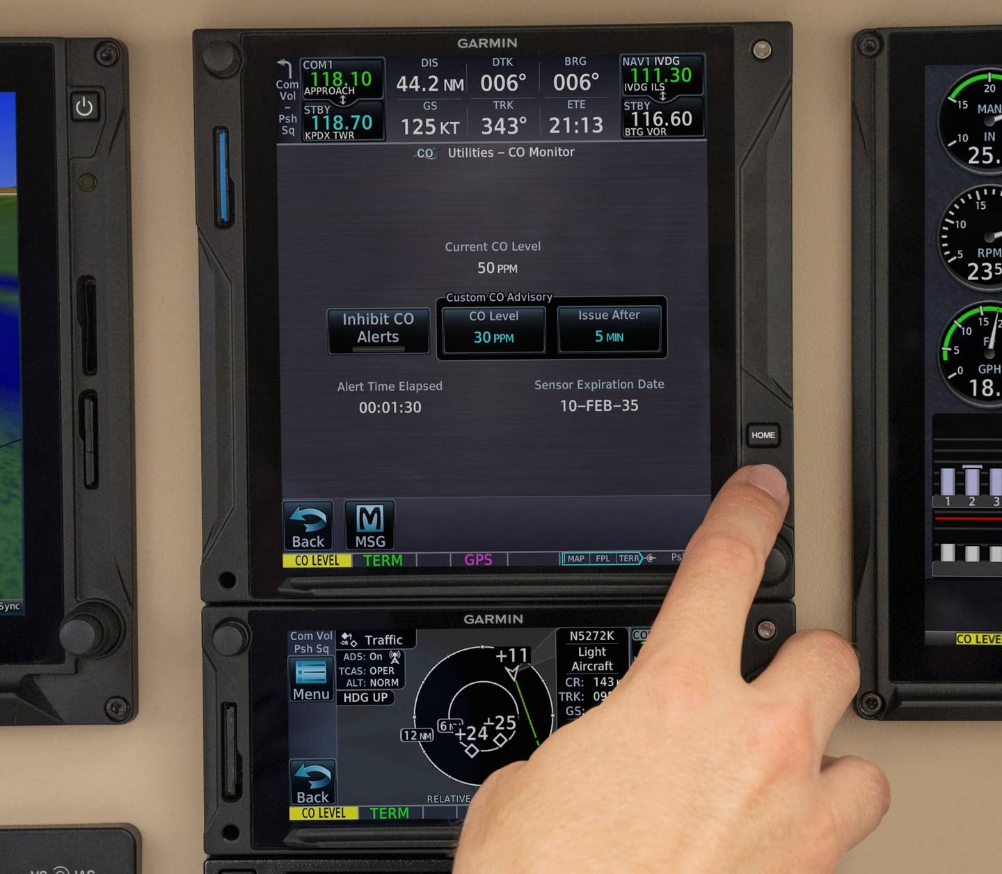
Garmin doesn’t advertise the fact very much, but many of the features on the new graphical interface for its Aera portables, its GTN panel-mount navigators and its next-gen flat-panel suites have their roots in consumer products, like portable auto navigators, smartphones and outdoor GPS products. With consumer gear, the key is to make the learning curve as easy as possible, so people with no specialized training or expertise can use the equipment quickly and without a lot of study. How you do that is no secret. You create a highly graphical user interface with multiple ways to do the same chore — touch screen, hard keys, soft keys, etc. — and you keep the menu system as shallow as possible, something that’s a hard lesson for some manufacturers.
Garmin has applied all of these lessons on all of its latest products. To operate the G2000, for instance, you can use the touch controller to activate a graphical icon representing what you want to do. A simple home-screen icon takes you to a page of icons that lead you in your intended direction. A hard button for "direct to" navigation is on every box, and the menus are so shallow and intuitive, it's impossible to get lost.
Contrast that with the G1000, with its chapters and pages menu system with functions, such as vertical navigation, located several levels below the surface. Knowing the lay of the land with G1000 is absolutely essential to a successful experience. With G2000, all that complexity is gone. It's easy in a case like this to miss the revolution. The fact is, Garmin doesn't want you to notice it. It wants it to be so easy you miss it altogether while you're enjoying your flying.

Sign-up for newsletters & special offers!
Get the latest FLYING stories & special offers delivered directly to your inbox

